Misreading a multispectral map is a costly mistake. The colors aren’t a simple instruction manual; they’re data points whose meaning changes dramatically with crop stage, time of day, and the specific index used. True precision comes not from the drone itself, but from learning how to perform contextual diagnostics—understanding *why* a map looks the way it does to make the right nitrogen application decision every time.
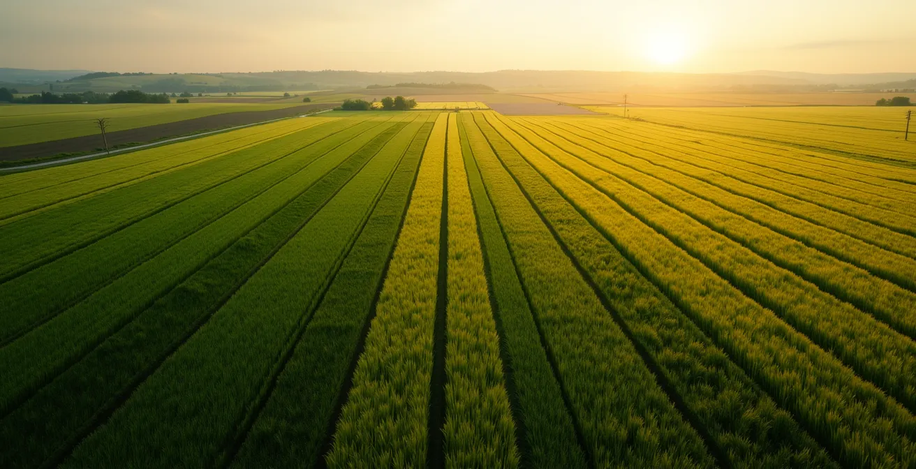
For agronomists and forward-thinking farmers, multispectral drones have promised a new era of precision. The bird’s-eye view, rendered in a rainbow of colors, seems to offer a clear roadmap to crop health, pointing directly to areas needing a nitrogen boost. Yet, the reality is often more complex. Many users find themselves with beautiful, data-rich maps but remain uncertain about the crucial next step: turning that visual data into a confident, effective variable rate application (VRA) strategy.
The common advice is to simply “use NDVI” and apply more fertilizer to the red zones. This oversimplification is the root of many failed precision ag programs. It ignores critical variables like canopy closure, spectral saturation, sun angle, and even the type of stress the plant is under. A red spot on an NDVI map isn’t always a cry for nitrogen; it could be a sign of water stress, pest pressure, or simply a natural part of the crop’s late-season senescence. Relying on a single index without context is like a doctor making a diagnosis based only on a patient’s temperature.
The key to unlocking the true power of this technology lies in shifting from passive observation to active interpretation. This guide will move beyond the basics of “what is NDVI” and delve into the nuances of contextual diagnostics. We will dissect why popular indices can be misleading, how to build a geometrically sound data foundation, and how to layer different data types—from multispectral to thermal—to get a complete picture of crop health. The goal is to equip you with the analytical framework to read what your fields are truly telling you, ensuring every drop of nitrogen is an investment, not an expense.
To navigate this complex topic, this article breaks down the essential components of accurate imagery interpretation. From selecting the right index to predicting future needs, each section builds upon the last to create a comprehensive workflow.
Summary: A Guide to Interpreting Multispectral Drone Imagery for Precision Nitrogen Management
- Why NDVI Maps Can Be Misleading in Late-Season Corn?
- How to Stitch Drone Images Without Distortion or Gaps?
- Fixed-Wing or Quadcopter: Which Covers 500 Acres Efficiently?
- The Time-of-Day Mistake That Ruins Spectral Data Consistency
- What Altitude Provides the Best Balance of Resolution and Coverage?
- How to Scout for Corn Borers Before They Enter the Stalk?
- Thermal Cameras or Visual Scouting: Which Finds Stress First?
- How to Use Farm Data Analytics to Predict Next Year’s Input Needs?
Why NDVI Maps Can Be Misleading in Late-Season Corn?
The Normalized Difference Vegetation Index (NDVI) is the workhorse of drone-based crop scouting, and for good reason. In early growth stages, it provides an excellent overview of plant vigor. However, as corn enters its later reproductive stages, relying solely on NDVI becomes a critical error. The primary issue is spectral saturation. When the crop canopy becomes dense and multi-layered, NDVI values plateau. The index can no longer distinguish between a healthy, sufficient-N plant and a super-charged, high-N plant; to NDVI, they both look “green enough,” returning a maximum value and hiding crucial variability within the field.
This is where the Normalized Difference Red Edge (NDRE) index becomes indispensable. Unlike NDVI, which uses the visible red light spectrum, NDRE uses light from the “red edge” region, which can penetrate deeper into the crop canopy. This allows it to measure chlorophyll content and nitrogen levels not just in the top leaves, but throughout the plant’s structure. As a result, studies confirm that NDRE can explain up to 88% of nitrogen variation in mature, dense-canopy crops, long after NDVI has lost its sensitivity. Using the wrong index at this stage is a common source of error; one case study showed a farmer avoided wasting 500 units of fertilizer by switching to NDRE when NDVI incorrectly indicated a drop in density due to the upper canopy turning yellow pre-harvest.
Therefore, the choice of index is not a one-time decision but must be adapted to the crop’s phenological stage. Early on, NDVI is effective for identifying establishment issues. But as the canopy closes (around V10-VT), a transition to NDRE is essential for accurate, late-season nitrogen management and to avoid the misleading signals of a saturated NDVI map.
How to Stitch Drone Images Without Distortion or Gaps?
An interpretable multispectral map is built on a foundation of geometric accuracy. Without it, you are making decisions based on a distorted reality. The process of creating a single, seamless field map—or orthomosaic—from hundreds or thousands of individual drone photos is called stitching. Poor stitching leads to gaps, blurry areas, and misalignments (distortions) that render VRA prescriptions and year-over-year comparisons useless. The most common cause of these errors is insufficient image overlap and a lack of high-precision GPS data.
To combat this, a flight plan must be designed with a high overlap, typically 75-80% front and sidelap. This gives the photogrammetry software ample common points between images to create a cohesive map. For maximum accuracy, especially in fields with uniform canopies like corn or wheat, a “crosshatch” or double-grid flight pattern is the gold standard. This involves flying the entire field twice, with the second flight path perpendicular to the first. This provides a much richer dataset and helps mitigate issues caused by canopy shadows and sun angle.
Even with high overlap, standard GPS is not enough for precision tasks. This is where georeferencing technologies become critical. Real-Time Kinematic (RTK) and Post-Processed Kinematic (PPK) systems are essential for reliable map creation. These systems correct the drone’s GPS location in real-time or after the flight, and as a result, integrated RTK technology delivers centimeter-level accuracy. For the highest level of absolute accuracy, especially for comparing maps over time, using a few Ground Control Points (GCPs) in addition to RTK/PPK ensures that this year’s map will line up perfectly with next year’s.
Fixed-Wing or Quadcopter: Which Covers 500 Acres Efficiently?
The choice of drone platform is a classic trade-off between speed and flexibility. For large-scale operations, particularly fields of 500 acres or more, efficiency is paramount. In this scenario, a fixed-wing drone is almost always the superior choice for initial broad-acre mapping. Fixed-wing platforms are aerodynamically efficient, allowing them to stay in the air longer—often for an hour or more—and cover vast areas at higher speeds than their multi-rotor counterparts. This translates directly to fewer battery swaps and a significantly faster survey time for large fields.
However, this efficiency comes at the cost of flexibility. Fixed-wings require a clear area for belly-landing and cannot hover to inspect specific problem areas. This is where the quadcopter excels. With its ability to take off and land vertically (VTOL) and hover in place, a quadcopter is the ideal tool for targeted scouting. After a fixed-wing identifies potential stress zones across the entire 500-acre field, a quadcopter can be deployed to fly low over those specific GPS coordinates for a high-resolution visual or multispectral inspection.
A hybrid approach is often the most effective strategy for large farms. Use the fixed-wing for rapid, field-wide coverage to generate the initial NDVI or NDRE map. Then, use that data to create a targeted scouting mission for the quadcopter. This workflow leverages the strengths of both platforms: the endurance of the fixed-wing for broad coverage and the agility of the quadcopter for detailed analysis. One farmer reported that with this strategy, he could cover 150 hectares in just one hour with a drone, compared to only 10 hectares with a tractor, showcasing the immense efficiency gains possible.
The Time-of-Day Mistake That Ruins Spectral Data Consistency
One of the most overlooked yet critical variables in multispectral imaging is time. A plant’s spectral reflectance—the “fingerprint” the sensor is capturing—is not static. It changes based on the angle of the sun. Flying a field at 9 AM and then again at 3 PM two weeks later will produce two very different maps, even if the crop’s health hasn’t changed at all. This lack of temporal consistency makes it impossible to accurately track changes over time or build reliable predictive models.
The goal is to capture data at the same solar time for every flight, ensuring the sun is at the same position in the sky. This minimizes variations caused by shadows and changes in reflectance. The ideal window is typically within two hours of solar noon (when the sun is at its highest point), often between 11 AM and 1 PM. This is because it minimizes shadows within the canopy, providing the most consistent illumination. It is also crucial to fly only on days with clear skies or uniformly overcast conditions. Flying under scattered clouds creates a data nightmare, with the sensor capturing drastic light changes as clouds pass over the field.
An expert in the field perfectly summarizes the risk of ignoring this factor. As one Agricultural Remote Sensing Specialist noted in a planning guide:
Changes in sun angle relative to the sensor alter the perceived reflectance of the canopy, which can make a healthy area appear stressed or vice-versa if flights are not conducted under consistent lighting.
– Agricultural Remote Sensing Specialist, Drone Survey Planning Guide 2025
To ensure repeatable and comparable results, all flights for a given field throughout a season must be conducted under the same lighting conditions and at the same time of day. This discipline is the bedrock of trustworthy temporal analysis.
What Altitude Provides the Best Balance of Resolution and Coverage?
Flight altitude directly controls two competing factors: image resolution and operational efficiency. Flying lower produces a higher resolution (a smaller Ground Sample Distance, or GSD), meaning each pixel in your map represents a smaller area on the ground, revealing finer details. However, flying lower also means the drone captures a smaller area per image, requiring more flight lines and longer battery life to cover the same field. The key is not to chase the highest resolution possible, but to select the altitude that provides the resolution sufficient for the specific diagnostic task.
For general vigor mapping or identifying large N-deficiency zones, a GSD of 5-10 cm (typically achieved at an altitude of 100-120m) is more than adequate and allows for efficient coverage of large areas. In contrast, tasks like early disease detection or identifying the “shot-hole” patterns of pest feeding damage require much finer detail. For these missions, a lower altitude of around 60m, providing a GSD of 1-2 cm, is necessary to see the subtle changes in individual leaves.
The table below provides a framework for matching the diagnostic task to the required resolution and typical flight altitude.
| Diagnostic Task | Required GSD | Typical Altitude | Processing Time |
|---|---|---|---|
| N-deficiency zones | 5-8 cm | 120m | 1 hour |
| Early disease detection | 1-2 cm | 60m | 4-8 hours |
| General vigor mapping | 10 cm | 150m | 30 minutes |
| Pest damage assessment | 2-3 cm | 75m | 2-3 hours |
To build confidence in your data, it’s wise to perform a multi-altitude calibration early in the season. Fly a small, representative block of a field at several different altitudes (e.g., 60m, 90m, and 120m). Compare the resulting NDRE/NDVI maps to see how the data changes with resolution. This helps you find the “sweet spot”—the highest altitude you can fly at while still capturing the variability you need to manage, thus maximizing your field efficiency.
How to Scout for Corn Borers Before They Enter the Stalk?
The real value of multispectral imaging in pest management is its ability to detect stress before it’s widely visible to the naked eye. For pests like the European Corn Borer, the window for effective treatment is small—after the larvae hatch but before they bore into the stalk, where they are protected from insecticides. By the time you see widespread “shot-hole” damage on the leaves from ground level, the infestation may already be advanced. Drone imagery allows for early, targeted detection to enable precise intervention.
Interestingly, the most vigorous, high-NDVI parts of the field are often where moths prefer to lay their eggs. A drone-assisted workflow can leverage this. The first step is a broad-acre flight (e.g., at 90m) to create a field-wide NDVI map. Instead of looking for stressed areas, you identify the healthiest zones (NDVI > 0.7) as primary targets for scouting. Once these high-vigor zones are mapped, a ground scout can be sent directly to those GPS coordinates for targeted inspection, looking for egg masses or early-stage larvae, making the scouting process vastly more efficient.
Furthermore, different indices can help differentiate pest damage from other stressors. Some research has shown that while NDVI is effective for detecting severe infestations, NDRE can be more effective for early detection of low infestation levels with high accuracy. This is because the initial feeding damage may cause subtle changes in chlorophyll that NDRE is more sensitive to. By generating GPS coordinates for anomalies in both NDVI and NDRE maps, you can create a highly targeted and efficient scouting plan, allowing you to find and treat corn borers before they cause significant yield loss.
Thermal Cameras or Visual Scouting: Which Finds Stress First?
While multispectral cameras read reflected light to measure chlorophyll content, thermal cameras measure emitted heat. This provides an entirely different, and often earlier, indicator of plant stress. A plant’s primary way of cooling itself is through transpiration—releasing water vapor through stomata on its leaves. When a plant is water-stressed, its stomata close to conserve moisture. This stops the cooling process, and the plant’s canopy temperature rises. A thermal camera can detect this temperature increase long before the plant shows any visual signs of wilting or discoloration.
In fact, studies have demonstrated that thermal cameras can detect pre-visual water stress 5-7 days earlier than a visual scout or even a multispectral sensor would. This lead time is invaluable, allowing for an irrigation intervention before yield potential is impacted. This makes thermal imaging a powerful tool for drought-prone regions or for managing high-value irrigated crops.
The most advanced diagnostic approach involves a “diagnostic triage” using a combination of sensors. By overlaying thermal and multispectral data, you can begin to differentiate between types of stress. For example, if a zone is hot on the thermal map but still green (high NDVI), it’s a clear early warning sign of water stress. Conversely, if a zone is cool (transpiring normally) but has low NDVI/NDRE values, the problem is more likely a nutrient deficiency, such as nitrogen. The table below outlines a basic framework for this triage process.
| Detection Method | Stress Type | Lead Time | Interpretation |
|---|---|---|---|
| Thermal High + NDVI Low | Water stress | 5-7 days | Immediate irrigation needed |
| Thermal Cool + NDVI Low | Nitrogen deficiency | 3-5 days | Fertilizer application required |
| NDRE decline only | Early disease | 7-10 days | Scout for pathogens |
| Visual symptoms | Established stress | 0 days | Damage already occurring |
This multi-sensor approach moves beyond simple vegetation mapping and into true plant health diagnostics, allowing you to apply the right solution to the right problem, often before the problem even becomes visible.
Key Takeaways
- NDVI is unreliable in dense, late-season corn; switch to NDRE for accurate nitrogen assessment.
- Achieve map accuracy with 75-80% overlap, crosshatch flight patterns, and RTK/PPK technology.
- Fly at the same solar time (near noon) to ensure data is consistent and comparable over time.
How to Use Farm Data Analytics to Predict Next Year’s Input Needs?
The ultimate goal of collecting precise farm data is not just to fix this season’s problems, but to create a system of continuous improvement that makes next year more efficient and profitable. A single season’s multispectral map is a snapshot; a multi-year archive of maps is a roadmap. By stacking several years of high-quality, consistently collected data, you can move from reactive management to predictive analytics.
A powerful technique is to layer 3-5 years of mid-season NDRE maps. This process of multi-layer analytics smooths out annual weather variations and reveals the stable, underlying productivity of your fields. You will clearly see zones that are consistently high-performing, average, or low-performing. These are your true management zones, based on years of actual crop performance rather than a single soil map. This historical performance data forms a much more reliable basis for creating next year’s variable rate prescriptions for seed and fertilizer.
To take this a step further, you can create a Nitrogen ROI map. This involves overlaying three key data layers from the current season: the “as-applied” nitrogen VRA map, the end-of-season NDRE map (showing plant response), and the combine yield map (showing final results). By analyzing these layers together, you can identify zones where high rates of N did not lead to a corresponding yield increase (over-application) and, more importantly, find zones where low N rates still produced high yields (highly efficient zones). This insight is invaluable for optimizing next year’s budget.
Action Plan: Building Your Nitrogen ROI Map
- Layer 1: Import this year’s as-applied nitrogen VRA map showing actual rates applied.
- Layer 2: Overlay the end-of-season NDRE map showing the final plant response to the nitrogen.
- Layer 3: Add the combine yield map showing the actual performance outcome for each zone.
- Analysis: Identify zones where high nitrogen application did not increase yield, indicating over-application and wasted input.
- Analysis: Pinpoint areas where low nitrogen rates still produced high yields, identifying naturally efficient zones.
This analytical process transforms your drone from a simple scouting tool into the foundational element of a farm-wide data ecosystem. It allows you to learn from every season and fine-tune your input strategy with increasing precision each year.
To put these principles into practice, the next logical step is to begin building your own multi-year data archive and create your first Nitrogen ROI map to optimize your application strategy for the coming season.